Thank You
Users want a smoother, faster experience with easier access to the menu, fewer steps, and quicker navigation. They prefer the menu as the landing page, visible past orders, and a clear reorder option. Suggestions include better customization flow, dark mode, liked/bestseller sections, more payment options, a smaller QR code shown on demand, simpler coupon use, clearer purchase buttons, and easier feedback sharing.
Conclusion
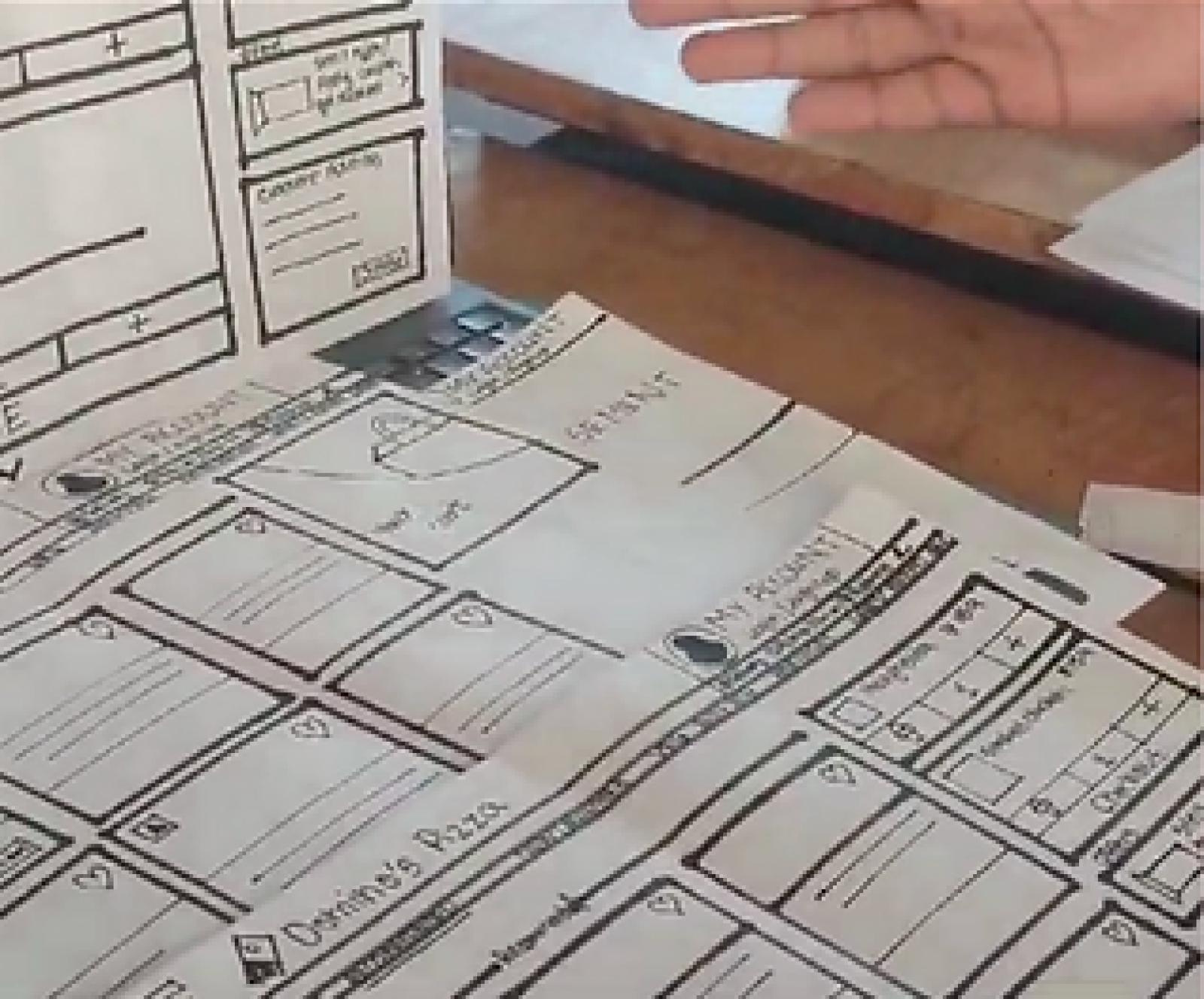
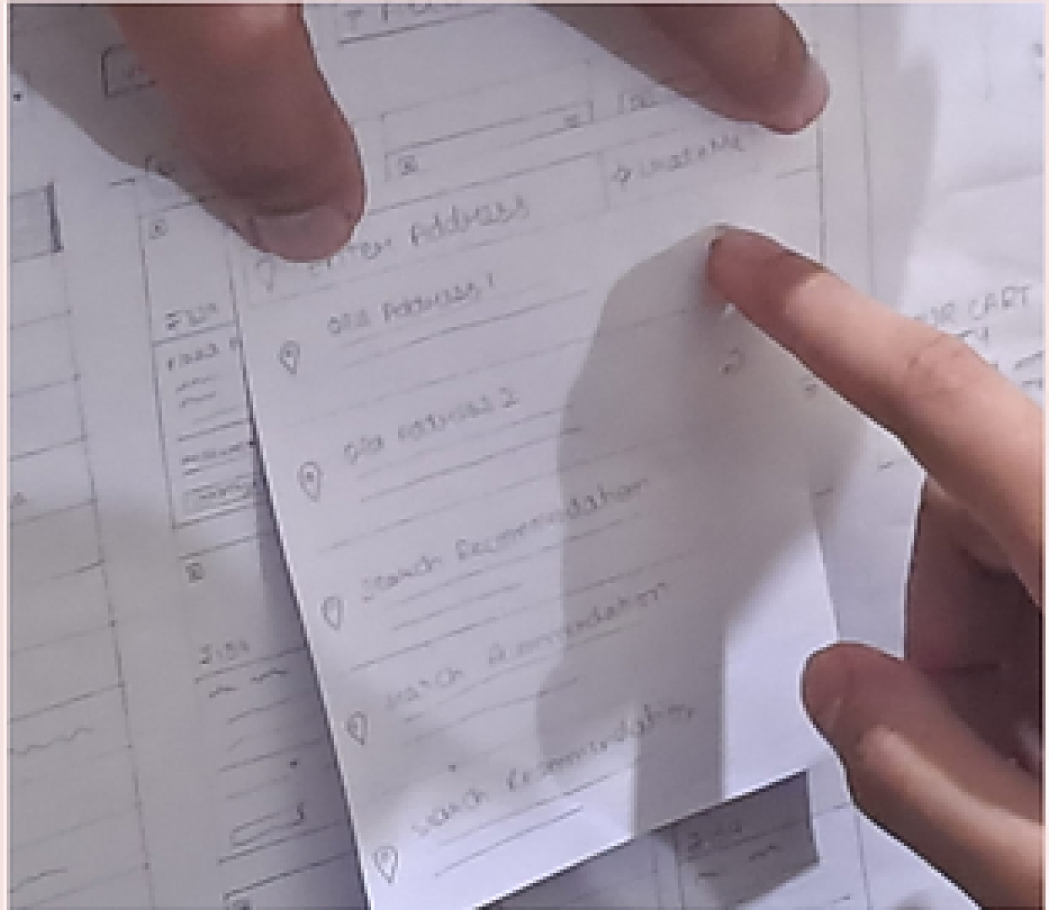
Validation Process Images
Based on user feedback, the preferred enhancements focus on improving menu accessibility, streamlining processes, and adding features that enhance user engagement. Key recommendations include prioritizing best-selling items, simplifying the checkout process, and integrating features like mobile notifications.

Testing Phase
Testing was conducted with 6 participants representing the target audience . They worked through tasks using prototype screens in person to evaluate three different concepts. A semantic scale was used to gather detailed feedback on usability, functionality and satisfaction. The goal was to identify the best user experience, guiding further design decisions. Elements from each group member’s concept and user suggestions were then combined to create a final concept.
User
Feedback
User - 1
Liked large pizza images; wants menu shown first; dislikes entering address twice; customization is cluttered; wants previous orders at top; add veg/non-veg filter; show QR after "Show QR" click.
User - 2
Prefers best sellers over recommended; wants liked pizzas section; coupon should confirm on apply; make purchase button more visible; QR code should be smaller.
User - 3
Add dark mode; replace recommended with bestseller category; wants checkout/payment on menu page; send payment confirmation via app; add 'Liked' category.
User - 4
Too many steps to menu; wants menu as landing page; allow outlet selection; remove expandable map; make reorder option more visible.
User - 5
Navigation is slow; show promos on landing page; easier access to account & past orders; more payment options; add easy feedback option.
User Testing: Conducted with a diverse group to gather qualitative and quantitative feedback.
Observation: Direct observation of user interactions to identify behavior and difficulties.
Surveys: Post-testing surveys using a Semantic Differential Scale to assess user satisfaction.
Validation Method
Similar Analysis was conducted with 4 other users
Simple
Flexible
Clear
Consistent
Comfortable
Helpful
Efficient
Interesting
Relevant
Complicated
Rigid
Unclear
Inconsistent
Overwhelming
Unhelpful
Inefficient
Boring
Irrelevant
1
2
3
4
5
6
7
Usability Testing Report
Prototyping Finalized Concept
Improvements made
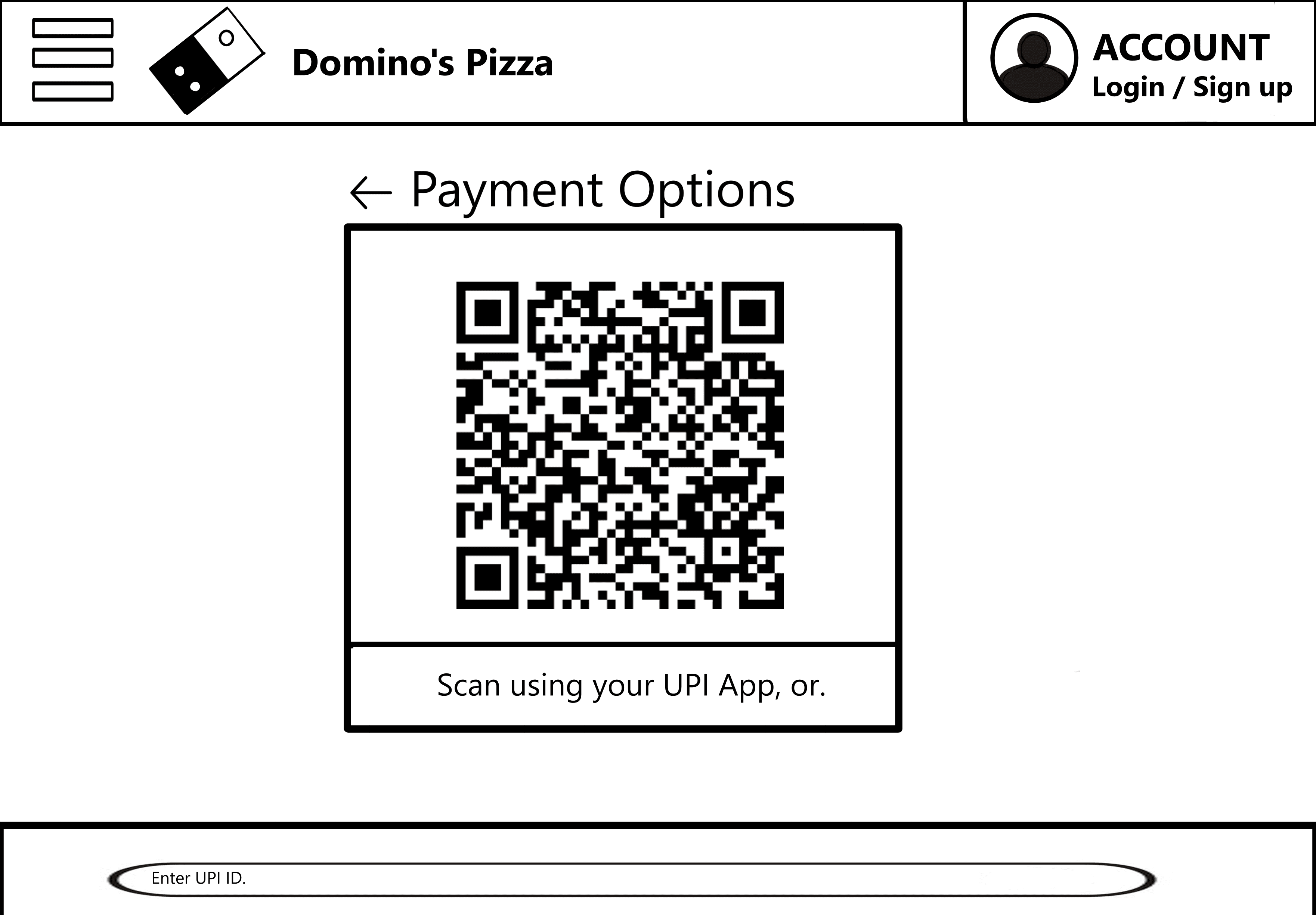
Improving the user experience by asking for location just once and removing unnecessary download options. Ensure all choices look consistent and give clearer location info. At checkout, display coupon savings, apply them correctly, and fix payment method labels. For payments, highlight the "Place Order" button, add a QR scanner for UPI, and make the close button more visible.


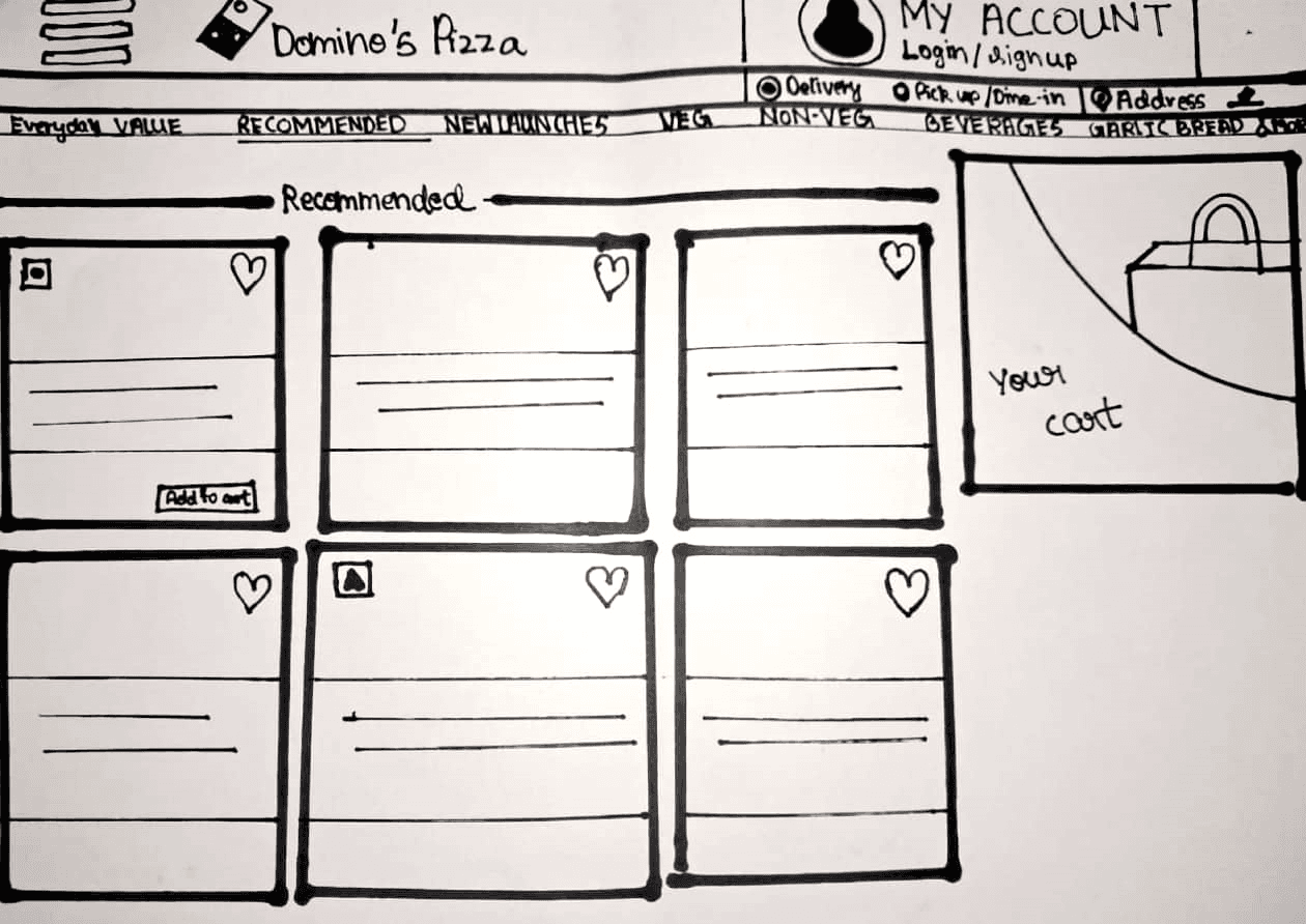
Landing page / Menu
Options
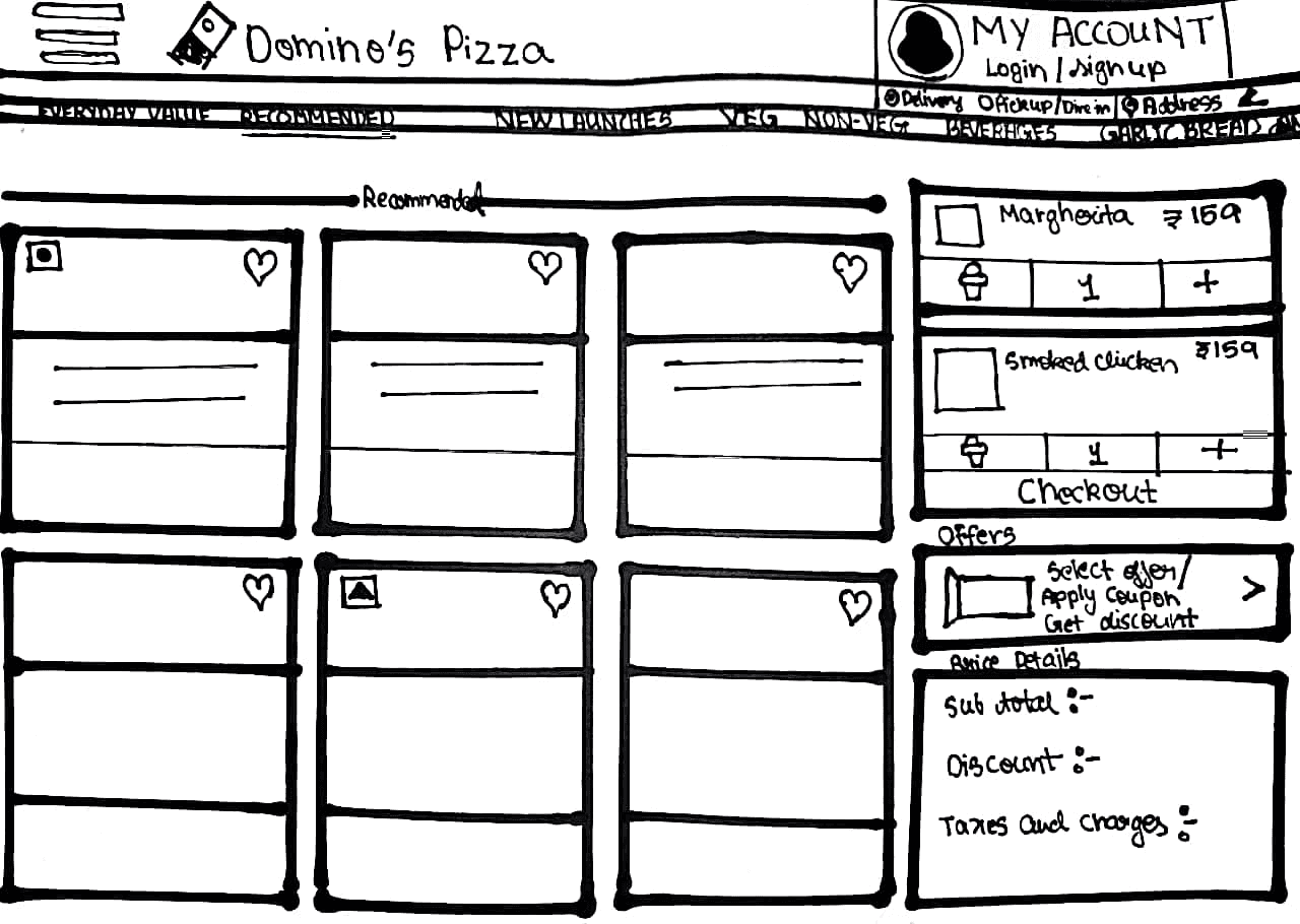
Cart preview
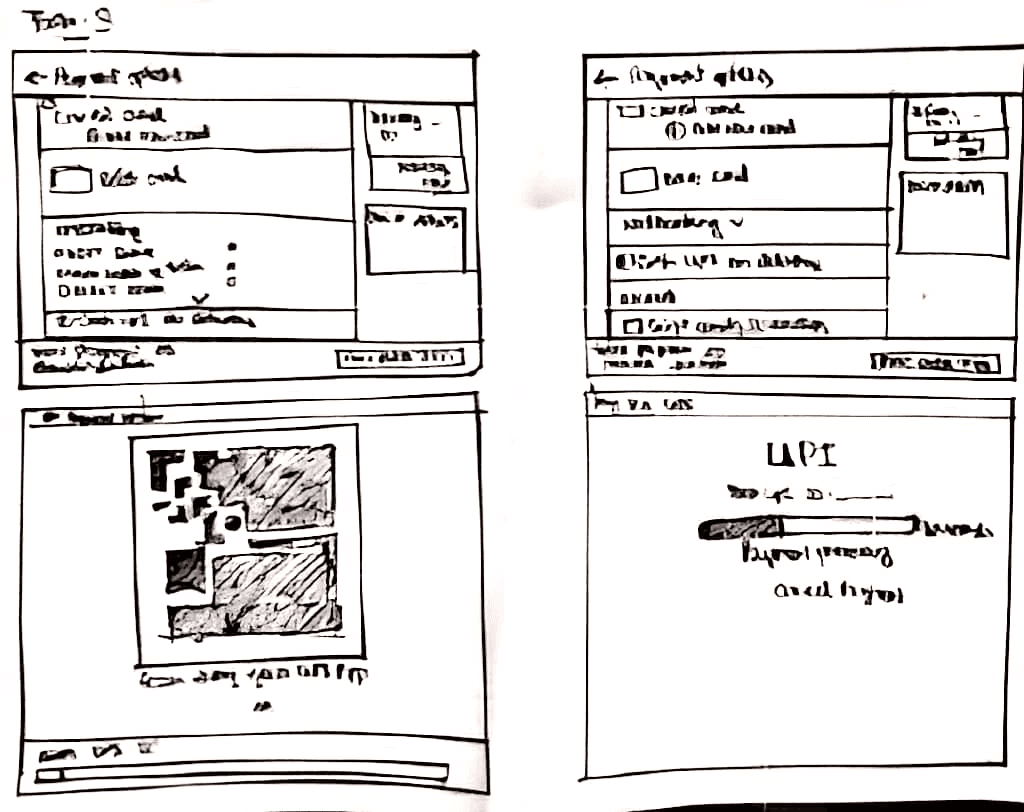
Payment options
UPI scanner payment and UPI ID payment
Payment processing screen for UPI payments
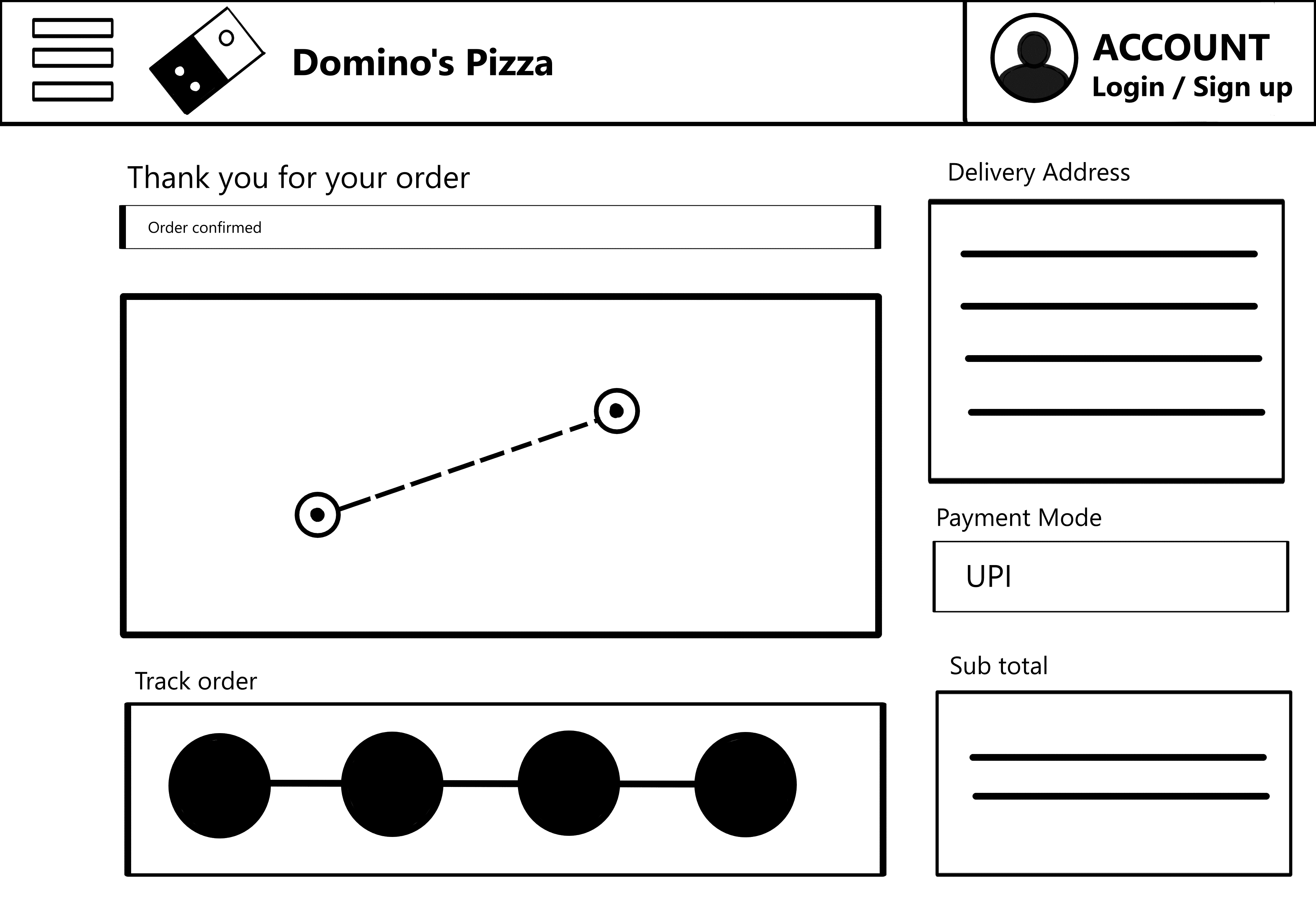
Order confirmation and tracking screen


Iteration - 2


The platform simplifies sign-up and profile setup with onboarding tips. Matches are curated based on tier-based recommendations from your trusted first and second-tier circles (family, friends, and their networks). Privacy and safety features ensure secure, meaningful matchmaking.


Iteration - 1

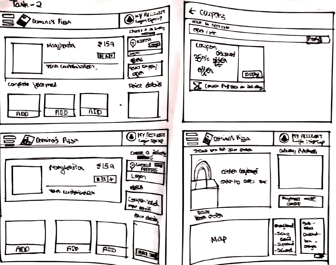
The platform is similar to the previous website with a couple of differences . Entering Address is set upon clicking on the website which is similar to the og website design. The differences are that the payment option should give priority to UPI more than any other method considering it is the most widely used method. That along with the change in tracking your order where you are shown a timeline with each stage in the timeline being representative of how close your order is to your location.
Heuristic Analysis Report
The website requires too many steps for tasks like ordering and applying coupons, with unclear instructions for new users.
Excessive Steps & Poor
Poor Visibility of Key Options:
Essential features like customizations and payment methods are hard to find and not prominently displayed.
Inconsistent Navigation & Redirection
Poor System Status Visibility:
The system doesn't show the status of actions, such as adding customizations or applying discounts, and the cost of additions isn't clear.
Inconsistent Design & Layout:
Design is inconsistent across pages, with color schemes that feel jarring and misaligned text, especially on the payment screen.
Customization Confusion & Lack of Pricing Clarity:
Customizations are confusing, and the additional costs aren't visible until checkout, leading to user frustration.
This is the File for the Heuristics in Figma. For Further interaction use this link.
Users are redirected too often, disrupting the flow, and the "Back" button leads to endless loading screens.
User Persona

Name: Kabir Kannan
Age: 20
Gender: Male
Location: Bengaluru
Occupation: Full-time College Student
Education Level: 3rd Year, pursuing a degree in Industrial arts and Industrial Design practices
Income Level: Part-time job; limited disposable income
Tech Savviness: High (comfortable with technology, uses various apps and websites regularly)
Long loading times or complicated navigation on websites.
High delivery fees or minimum order requirements.
Limited payment options or issues with payment processing.
Bio
Motivations
Frustrations
Goals
Convenience and speed (wants a quick and easy ordering process)
Promotions and discounts (always looking for student discounts or special deals)
Quality and variety of food (enjoys a variety of toppings and meal options)
Quickly order food during busy study sessions or late-night cramming.
Find affordable meal options with good value.
Prefer a straightforward and efficient ordering process.
Customer service
Critical User Journeys
Location drifting
Parcel service
Pick- up and drop
Market Analysis
The goal is to evaluate strengths, weaknesses for improvement by understanding how the analyzed product performs relative to its competitors or an ideal standard. We also looked into other apps that share a similar domain with our chosen app, to understand certain features better
Reasons
NA
NA
3.5
3.5
3
3
4
1
3.5
2.5
3.5
3.5
Tried to contact customer care on uber and ola after problems with a. ride and it redirects us to a chat bot which does not address the problem in any way. Swiggy redirects to a chat bot for a few mins- 30 mins after placing an order and then asks if if we need any more help talking to an executive.
When it comes to location drifting for Uber it is really accurate and has been the most reliable out of all the three, second goes to Swiggy because they get to the Locality a lot quicker but struggle to find the exact Location. And Last place goes to Ola because it is the least reliable of the other two.
Analysing the first screens of the parcel service on each app, we found Swiggy's interface to be the best one as it provides all the details like max. weight, charge per km and other necessary details for the parcel. Ola gives lesser details on parcel size and other restrictions. Uber is the least efficient as it provides no details about the parcel or delivery whatsoever. Uber also puts same service in three categories of 'Send a Package, 'Receive a Package' and 'Store Pickup' which is unnecessary.
For Pick up and drop Swiggy and Uber perform similarly well, the reason being they are more reliable compared to ola such as they do not cancel the ride in the beginning or in the middle of the journey or order and don't create any sort of discomfort to the customer compared to Ola.
Logo
Swiggy

Logo
Ola

Uber

Pluralistic Walkthrough
Ola, Uber, and Swiggy offer varied experiences in customer service, location drifting, and pickup/drop. Uber has faster support but struggles with location accuracy, while Ola provides better location tracking but slower response times. Swiggy excels in parcel delivery but faces occasional location drift. Both ride-hailing apps offer smooth pickup/drop, with Ola being more localized and Uber more widely available.
Chosen Task Flows
Getting to the menu
1
Payment
2
Tracking
3
To check other task flows explored click the Figma link.
The old Domino's website was slow, cluttered, and hard to navigate, leading to frustration and abandoned carts. Its outdated design and lack of personalisation made it fall behind competitors.
The Problem
The Goal
The goal was to create a faster, cleaner, and more user-friendly site to boost customer satisfaction and online sales.
Research Methodology
Pluralistic Walkthrough - Analyzed user Interactions across three pick up and drop apps - Ola, Uber and Swiggy - to benchmark features and references
Heuristic Analysis - Evaluated against Jakob Nielsen’s principles to identify usability issues in 3 task flows - Ordering, Tracking and Payment
Prototyping and User Testing - Designed and tested new concepts to address identified challenges focusing on these 3 main task flows mentioned above.
Duration
1.5 weeks
Toolbox


Skills
UX Development
Research
Interviews
Prototyping
Members
Anmol Moorthigari
Deborshi Deb
Hardik Monga
Objective
Identify usability issues impacting user experience
Develop solutions that align with heuristic principles.
Prototype and test improved designs for workflows.
Project Overview
Evaluated three digital products by identifying goals, CUJs, and conducting a pluralistic walkthrough. Analyzed Domino’s website through user personas, task flows, and heuristic evaluations to uncover usability issues. Developed and validated interactive prototypes based on refined concepts from key tasks.
Revamping
Dominos
